

Gone are the days of noisy modems and dial up internet.
Now you can browse the net from anywhere – in a shopping centre, a cafe, a bar, the car (not whilst driving of course) – smart phones and tablet devices allow you to look up information on businesses, products and services on the fly.
This article discusses ways your business website can be optimised for different mobile devices, ensuring maximum results for your online reach.
Mobile Friendly Web Design
There are a few options you can consider for optimising your website for mobile devices. Below we will discuss three of the most common options.
Responsive Web Design
What is responsive web design? These fairly new buzz words refer to websites that have been specifically crafted to adapt to the different resolutions of mobile devices.
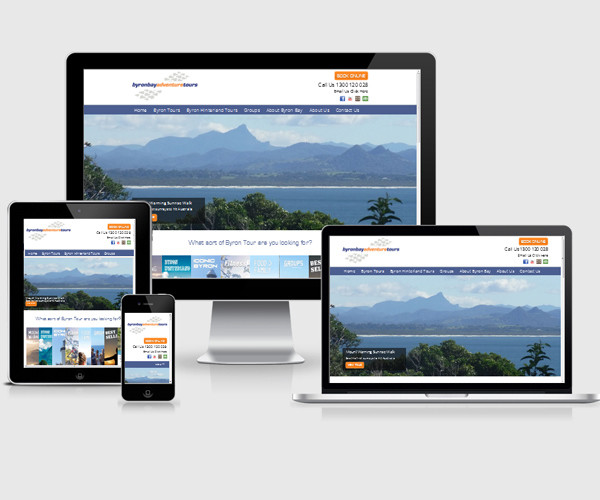
Take a look at the image below:
You can see how the images and text on this website adapt to fit on the different screen sizes.
In particular look at how it displays on the small mobile device – the logo is now on a row of it’s own – no need to scroll across the page or zoom right in to be able to read the text. The menu is no longer a long navigational bar – instead you now click on a menu button that vertically displays the page links making it much easier to navigate the website on a small screened device.
This is an example on how resposive web design works.
We at Digital Spice are big fans of responsive web design and we use this approach with most of the modern websites we develop.
Check out our web design portfolio here.
The largest advantage of responsive web design is the fact you do not need to maintain an addititional website and your branding look and feel is consistent across all devices.
Alternate Mobile Version
Some businesses choose to have an alternate version of their website loaded when their website is viewed on a mobile device.
If your main website (desktop version) contains a lot of content; or uses a lot of flash based graphics, having an alternate mobile version might provide a good option.
Flash produced content cannot be viewed via iphone / ipad devices or the latest versions of Android devices.
An alternate mobile website is also a good solution for businesses only wanting to show focused or stripped back content on mobile view.
Custom Mobile Apps
Another option is to have a custom mobile app developed for your website.
If your website has a lot of dynamic functionality, such as a business directory website that has a lot of business listings – development of a mobile app might provide the best means for accessing and displaying the website content.
Choosing the right method that would work best for your needs really comes down to the sort of content you intend to have on your website.
Contact Digtial Spice today to discuss your mobile friendly website needs.